Horror display font with open-license use
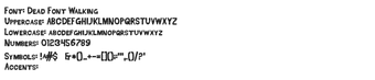
Dead Font Walking, created by Andrew McCluskey, is a decorative horror typeface made for posters, logos, and themed digital artwork. The font gives text a heavily distressed, 'decayed' appearance with jagged edges and uneven strokes that suggest a hand-crafted, post-apocalyptic aesthetic. The design draws on The Walking Dead logo style, and it targets graphic designers, content creators, and genre fans needing bold, thematic display typography.
What does the font add to a headline or poster?
The font supplies a gritty display voice while preserving readability through deliberate letter shaping. It preserves clear counters and distinct terminals so short phrases remain legible even with heavy texture, a design choice intended to keep impact at large sizes without collapsing into noise. Use it where texture and atmosphere are core to the message, not where long passages must be read.
How much typographic flexibility does it give?
The typeface is a single decorative face rather than a family of weights, so variety depends on manual typographic work: case switching, tracking, and scaling. The glyph inventory covers basic Latin letters, numbers, and punctuation across approximately 99 to 103 glyphs, which supports standard headlines and logos but limits extended language coverage and alternate glyph experiments.
Is the font straightforward to install and use?
Installation follows a standard workflow: download, extract the archive, and install the font file into the system font directory. It integrates with common design and office applications; supported hosts include Adobe Creative Cloud apps, Microsoft Office, and typical video editing suites. Because it uses conventional font files, managing and deploying it in shared projects matches existing font-management practices.
Does it fit cross-platform production workflows?
The font works on desktop platforms and integrates into shared project pipelines, which aids team distribution. Its recognizably distressed style creates a strong genre association, so brand teams should confirm fit before using it as a primary identity face. The developer released it as a themed display resource intended for short-form, high-impact typographic roles rather than continuous body copy.
A focused choice for designers needing genre-specific headlines
The font is a practical option for projects that require an aggressive, horror-inflected headline face, and its availability in OpenType and TrueType formats makes integration straightforward. Practical tip: convert headline text to outlines or raster at high resolution for print to preserve fine distressed details. It best suits short, attention-getting typography in promotional and themed media.